About the pictures..
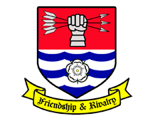
The shield is the logo for the Airedale Longbow club. They initially had
the design on a piece of paper, but had clear thoughts on how it should
look. 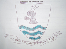 This is what they started with. As you can see, the logo matches
their original idea, but is now presented in a manner that has been used
on their web site, letterheads, certificates, badges and on clothing for
members.
This is what they started with. As you can see, the logo matches
their original idea, but is now presented in a manner that has been used
on their web site, letterheads, certificates, badges and on clothing for
members.
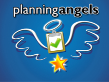
Planning Angels logo / branding is the start of the new company based in
Leeds which will be planning agents for ANY type of event.
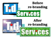
Tid Services have commissioned WebsPlus to build them a web presence
from scratch, again with a style in mind, and this is their logo
before and after we have adapted it for their site.

(Re)branding....
Your brand is your finger print in the world of corporate identification.
Everyone wants their identity to be unique and be associated with the business
they conduct or product they sell.
e.g. The two milk glasses picture and the words "a glass and a half" are synonymous
with Cadburys chocolate.
Above are three examples of our branding. The first, from a small design,
brought to life as a logo, the second a complete logo from scratch,
based on an idea and thirdly an existing logo updated to match with the forward
motion of the company and the 'feel' of their website.
Make your mark and make it today!